I found this magazine advert for the album from
Jessie J “WHO YOU ARE”.
There are the obvious features such as artists name to make it clear who is being advertised, the album name to show what
is being advertised. There is always an eye
catching image, whether it be of the artist or a unique conceptual
image, this not only shows us who
the artists are but also gives an indication to the genre and artist style. A release date is often shown to
highlight when the audience can
get hold of the album and quite often ways
of downloading the album/song to show where and how
the audience can get hold of the music, making it easy will increase sales.
Song featured in the album
is also common, often well known, chart music to get the audience hooked into why they should go away and buy the
album/song, along with the new album
cover to show what they
can buy, also if its easily recognisable when they see it in shops they will be
inclined to pick up a copy. Websites
are often added to an advert to make it easy for an audience to know how to find out more, also to create
a further possibly interactive relationship between artist and audience. Quite
often an artist will have a certain font
or logo that they are associated with, this helps an audience identify who the artist is and learn more
about their style/genre. Occasionally the record label will have their logos printed small onto the adverts
to build up artist profile, and audience can see who represents them and others they are associated with.
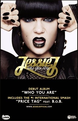
Jessie J's magazine advert meets
many of the typical contentions, her name, album name, eye-catching image, hit
singles, guest star/s, her own website and also logos of record labels. The
advert itself if very striking, with the uses of black, white and gold. This
gold colour may connote that she is expensive and everyone will want it because
this album is something special and luxurious as is gold.
She is easily recognisable with her signature
black bob with block fringe, matching with her dark clothing, makeup and nail
varnish. The close up of her looking face on into the camera takes up the top
two thirds of the advert, making it fully focused on her, and being her debut album
it also helps to create a strong, fierce artist persona. The bottom third of
the advert is taken up with the important information needed in the magazine
like the album name, hit singles, website and record labels, these stand out
well from the black background with the uses of white and gold and also a very
simple 'caps' font so it is therefore bold and easy to use. Her name is pasted
across the image of her in her signature font, also in gold to keep the typical
genres of wealthy and powerful, which links well with her strong image. And by
showing her website address fans can create a further relationship with the
artist, finding out more about her, helping to create loyal fans.
No comments:
Post a Comment